|
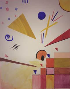
Title: Abstract 1
Medium: Gouache on 48.26 cm x 60.96 cm Bristle Board Size: 48.26 cm x 60.96 cm Completed September 2018 This abstract piece inspired by abstract artist Wassily Kandinsky and is meant to represent emotion in an abstract form. |
Inspiration
|
Wassily Kandinsky was a Russian painter from the 1900's to the 1940's who often focused on the Der Blaue Reiter movement. The Der Blaue Reiter movement was structured around colors and form in how they interacted with each other to bring unity to the piece. This unity was thought to bring spiritual values to the elements in the pieces, particularly since they were abstract elements. The movement is called Der Blaue Reiter because the founders' believed blue contained the most spiritual energy. I was inspired by Kandinsky's pieces titled Improvision 26 and Merry Structure. At first I was inspired by Improvision 26 for the way it blended colors together so effectively while still leaving behind residue of the original color at the place it was originally put. Improvision 26 seemed to give out a feeling of true watercolor, as if the brush were put on the paper and left there for the paper to absorb the color. The shapes on the piece are truly organic as they have seemingly no pattern to their curves and lines. The mix of color was also strategic as there were only primary and secondary colors in the piece. These colors were then balanced by black lines and shapes that brought unity to the overall piece.
|
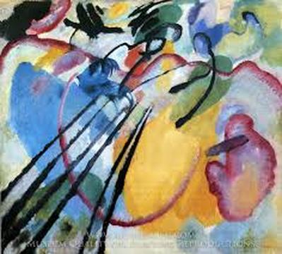
Improvision 26
|
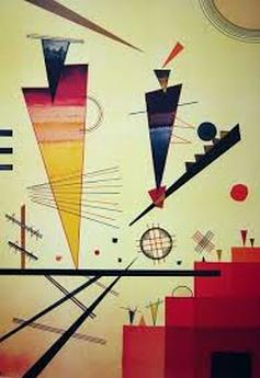
Merry Structure
|
However I wanted to have more sophisticated elements of abstract art in my piece by having less organic shapes in my piece and more geometric ones. I also liked the pattern of warm colors balanced by cool colors in Merry Structure. The whole paper was balanced by different groups of shapes in strategically placed areas of the paper, for example, there was a variety of squares placed on the lower right hand corner with each square being a different shade of red. I also liked that shapes were often made using various thin lines with a variety of brown and black lines of different thicknesses in the lower left hand corner to bring to bring a balance to the strong red squares in the lower right hand corner. I wanted to have that kind of balance in my piece so I planned on doing a similar pattern with squares in the bottom right corner and thick and thin lines on the lower left hand corner.
|
Planning
|
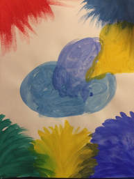
For my first sketch I used primary colors and made organic shapes on the paper using Improvision 26 as the inspiration. I tried to get a general idea of what Improvision 26 looked like in the sketch as well as the lines on it.
|
|
|
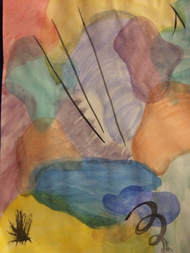
For my second sketch, I tried to get a better feel on how to get different opacities with the gouache as well as how to spread the gouache on the paper so that as I spread it the opacity would make the same shape look as if it were different shades of the same color by simply having different opacities.
|
|
For my third sketch, I had a lighter opacity with every color I used to get better at controlling both how to spread the gouache and how to lower the opacity. I also tried to blend colors by stacking them one over the other.
|
|
Process
|
|
The first thing I did was spread yellow gouache in a seemingly transparent shade in the lower left hand corner of the paper with gradual increase in the opacity. I also then layered the corner with increasingly warmer colors such as orange and red. The red color was at the very corner of the paper followed by the orange and then the yellow. I then drew a square pyramid similar to Kandinsky's in the lower right hand corner with a pencil and then painted each square in different opacities of reds, oranges, and yellows as well as different shades by mixing the shades of red, orange, and yellow I had. I made sure to get crisp edges by putting painter's tape on the line so that the gouache would not bleed out of the square. While painting one of the highest squares I had an orange shade drip onto a spot on the board and tried to use a napkin to absorb it off the paper, however, it still left a stain. I then used that same shade that had dripped into the paper to and painted a circle where the gouache had fallen.
|
|
After I finished painting the squares and turning the stain that dripped into the paper into a circle, I painted red and blue triangles above each row of squares and outlined one of the squares in black paint. I then began to paint elements on other areas of the paper, such as a yellow circle in the upper right hand corner of the paper and blue lined at the top middle of the paper. I then also outlined the yellow circle in the upper right hand corner in brown paint to emphasize it's presence in the piece.
|
|
|
|
The next big element of the piece was the big yellow triangle I painted in the middle left hand side of the paper. I made it by putting painter's tape on the page in the shape of a triangle and then painting the triangle to tape made in yellow gouache, using water to get different levels of opacity in different areas of the triangle. I then made organic shapes under the yellow triangle and began to make geometric shapes in red and blue paint to stick to the theme or primary colors. Since the yellow triangle took such a large amount of space in the page I wanted blue and red shaped to balance the presence of the large yellow triangle so I painted a blue circle to the right of the triangle and red and blue squares to the top left of the triangle. When painting the aforementioned squares I wanted to have them be more transparent so right after I painted them I dabbed them with a napkin so that it would absorb the color leaving only a small amount of color left behind.
|
|
Next I outlined the orange circle by the square pyramid and made two more triangles on the page. The first one I made was red and the next was brown, they were both made in the same manner the yellow triangle was made with painter's tape. The red triangle had the bottom part of it look unfinished since the painter's tape had made some of the paint not go onto certain areas but I used it as an opportunity to outline the bottom part of the triangle in black paint. I moved the painter's tape down a bit and I made sure that the tape was in the same angle as the bottom of the triangle. I then painted the border of the triangle in black gouache with a high opacity. On one of the swipes I accidentally went a little bit upwards so I decided to fix it by making a pattern of small triangles along the border of the red triangle. I then also added two intersecting yellow lines with red and blue lined around it.
|
|
Reflection
Looking back at my piece I realize I used both geometric and organic shapes while my inspiration used only geometric shapes. For example, I have a blue spiral in the middle left side of the paper, and my inspiration only has squares and triangles made of thick and thin black and brown lines which means there was a difference in the shapes and overall forms of the shapes in my piece compared to the inspiration. The form of Kandinsky's piece has a general composition of strictly geometric shapes throughout the entire piece while mine has both geometric and organic. However, a similarity is that there is a balance of cool and warm colors with a higher tendency for warm colors that balance each other. We also both have square pyramids in our piece and the places where the certain shapes and forms tend to be present are similar as well.
Connection to ACT
Clearly explain how you are able to identify the cause effect relationship between your inspiration and its effect on your artwork?
I was able to identify the cause effect relationship through the impact of the overall composition of my inspiration piece to my own piece in the elements and where I chose to put such elements in each piece.
What is the overall approach the author has regarding the topic of your inspiration?
The overall approach I had was both using his composition for the majority of my work yet still taking ownership over my own piece by making important edits to the piece such as color scheme and form through a combination of organic and geometric shapes
What kind of generalizations and conclusions have you discovered about people, ideas, culture, etc. while you researched your inspiration?
The kind of conclusions I discovered were that each color was thought to have a different kind of energy to them.
What is the central idea or theme around your inspirational research?
The central idea around my theme is identity and the influence of culture on identity
What kind of inferences did you make while reading your research?
The kind of inferences I made were that they were all simple pieces however I later realized that simplicity in a piece means there has to be so much more attention to detail
Bibliography
Kandinskypaintings.org. Merry Structure by Wassily Kandinsky. www.kandinskypaintings.org/merry-structure/.
The Art Story. “Wassily Kandinsky Overview and Analysis.” The Art Story, www.theartstory.org/artist-kandinsky-wassily.htm.
WassilyKandisky.net. “Improvisations.” Wassily Kandinsky, www.wassilykandinsky.net/improvisations.php.
The Art Story. “Wassily Kandinsky Overview and Analysis.” The Art Story, www.theartstory.org/artist-kandinsky-wassily.htm.
WassilyKandisky.net. “Improvisations.” Wassily Kandinsky, www.wassilykandinsky.net/improvisations.php.
