|
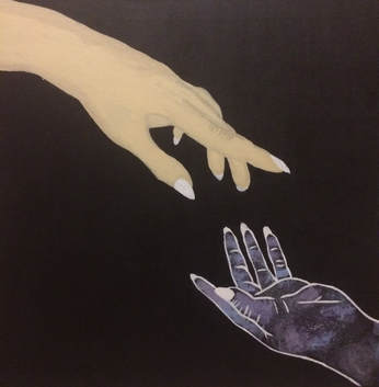
Title: Reaching
Medium: Acrylic Paint on Canvas Size: 60.96 cm x 60.96 cm Completed July 2018 The intention for this piece is to have it symbolize the way the minority youth of this generation feel like they are trying to reach for the stars and yet are still demanded more. |
Inspiration
|
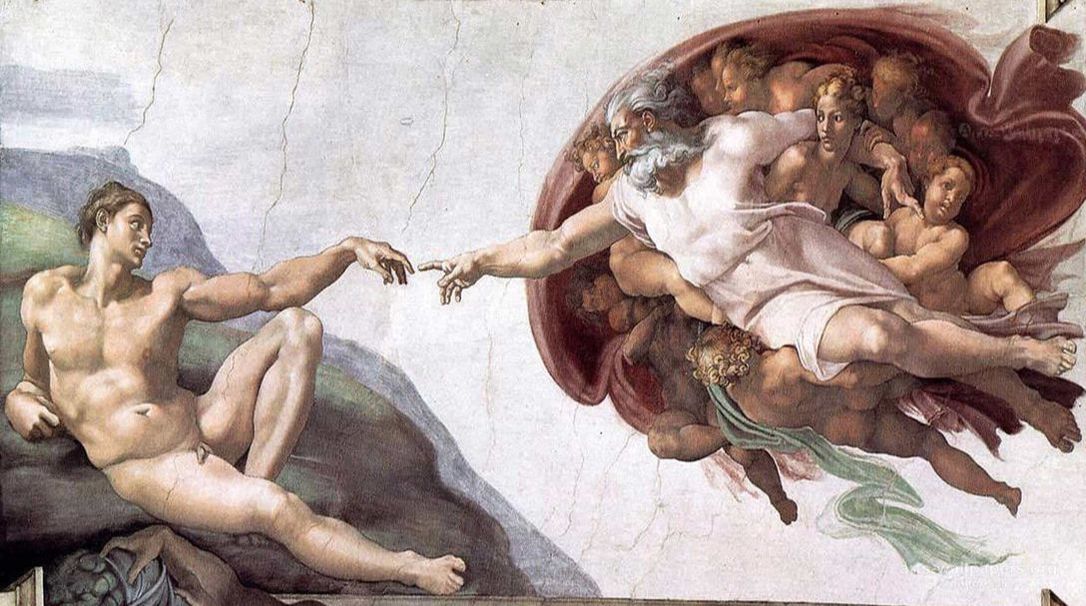
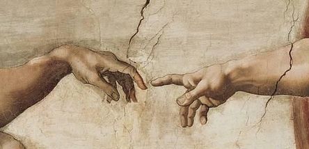
I was inspired by Michelangelo's piece The Creation of Adam. This piece is a fresco piece he did when he was commissioned to paint the Sistine Chapel's ceiling. All of his pieces on the church ceiling were meant to represent a story in the bible with The Creation of Adam representing the story in Genesis when God created the first human on earth, Adam. The piece is not only remembered for it's impeccable detail to every muscle of all the people but specifically the way the hands are positioned so that they're almost touching yet not quite. There is also a certain elegance to the way in which both their hands are positioned, not stretching yet still reaching out.
|
|
|
I wanted to achieve the same effect of having two hands that seem to reach our for each other but don't stretch. They rather gently point towards each other to show that they are trying to reach towards each other giving their body language a relaxed feel. I also considered having only one hand with a bubble over it containing a galaxy with the bubble floating yet looking as if the hand were almost holding it. I also wanted to try to perfect the technique Michelangelo used when shading the arms making them look so realistic. The way the shadows wrapped around the arm as a whole outlining the muscles in the arms as well as the veins in the wrists were details I wanted to include if applicable to the position in which the hand was being drawn and painted.
|
|
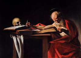
For the background I wanted to simply have a solid black background similar to that of caravaggio's paintings. I thought this would further emphasize the hands and the way they were positioned with each other. For example, the dark background in his painting Saint Jerome Writing brings emphasis to Saint Jerome and the setting he finds himself in.
|
|
Planning
|
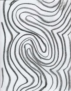
For my first sketch I thought about my painting being similar to Bridget Riley's piece Current. I thought it would be a good piece to be inspired by since it looks like ripples in the water which could show the butterfly effect. This could have fit in with my theme of youth feeling like they have to reach for more since the lines always get bigger and longer similarly to how with more expected that is expected of people the more responsibilities and growth there is in our lives.
|
|
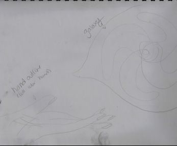
For my second sketch I wanted to have a hand reaching out for the galaxy which was inspired by Michelangelo's Creation of Adam piece. However, I wasn't sure if I wanted two hands or just one for the piece. My first thought was to only have one hand gracefully reaching out for what would look like a speech bubble with the galaxy inside of it. This however didn't seem like it would properly get my message across so I later changed it to two hands instead. The two hands reaching out for one another in a fashion similar to God and Adam in the creation of Adam seemed to achieve what I wanted my piece to get across to the audience.
|
|
|
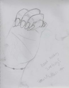
My third sketch consisted of a hand I drew using my own as a model which I wanted to have holding some sort of symbolic item. For the item I was very indecisive as to whether it should be some sort of book, a flyer, or something different. For this particular sketch it was very difficult to some up with the proper thing to have the hand holding to get my message across the way I wanted it to be so I decided to abandon the idea altogether, yet still use the sketch as a model for my other ideas, in particular my second sketch.
|
Process
|
The first thing I did was take pictures of my hands in a position that thought was similar to the positions in which God and Adam have them in Michelangelo's painting. I did this while positioning them over a black notebook so that it would be easier to outline the hand without having to worry about object in the background or too close to the hand. After a few pictures I picked out the ones I liked best and printed them out. I then cut them out so that only the notebook could be seen. First, I outlined the hand with a sharpie pen so that the transfer would be easier on to the canvas. Then, I measured the sides of the papers and divided them by however many rows I wanted in the grid. Using a ruler and a drafting triangle I made sure all rows were straight and even.
|
|
|
|
The next thing I did was use the ruler and drafting triangle to make a grid on the canvas exactly like the one on the paper. The first hand had a grid that was 3 x 7 squares and 5.25 x 7.25 in. I made a grid that I could use for this hand on the canvas positioning it on the corner so that it would look like the hand was coming from above. I then transferred the picture using a bianco stick (white charcoal stick) making sure to get all the lines I made with the sharpie on the printed picture into the grid. After that I did the same with the second hand on a 2 x 4 square grid although this time I had to make sure to position the grid exactly how I wanted it to look next to the other hand. After I had both hands drawn I got rid of the grid I drew with the bianco stick by covering it with black paint. I then outlined the second hand with white paint making sure to make all the lines clean and then I outlined the hand with white artist tape all around including inbetween the fingers to make sure no paint would get there.
|
|
I got all my paint ready which included blue, red, white, and black paint. The first thing I did was make half of the blue paint I had used lighter to make light blue and then use the other half to mix it with red and make purple. I wanted the purple I had to lean more towards a blue-violet so I made sure to have more blue paint than red paint. After that I made some of the violet paint I had just made lighter to have a greater variety of colors. I used a flat brush to pick up the different colors and I blended then on the hand in a circular motion making sure to overlap the colors once in a while. I also make sure to not have the same colors next to one another but rather have a greater variety in different places on the hand. When I finished a grabbed a toothbrush and covered the bristles in white paint. I then pushed my finger against the bristles to make the white paint splatter all over the hand. When finished I painted around the hand in black since some white paint had gotten on the surrounding area and took off the tape. Finally, I outlined the hand in white paint once more.
|
|
|
|
For the second hand the first thing I did was paint the nails. Then I used a skin tone made from half white paint, one forth yellow paint, one eighth red paint and one eighth brown paint. At first I painted that solid color on the hand but once I got to the fingers I used two mixtures I made using brown paint. In one mixture I out very little brown paint (about 1/8) while in the other I put a lot more (about 1/4). I used the paint with more brown towards the outermost part of the hand while I used the one with less brown paint between the initial skin tone and the outline. i also used the paint with 1/8 brown paint to make the folds in the skin of the fingers so that it wouldn't look too harsh but would still be visible. The last thing I did was clean up both hands one last time using black paint so that they would both look well blended and shaped.
|
Reflection
Looking back at my piece I could have tried to exaggerate the value through color on the top arm a little bit more since it seems like Michelangelo seemed to do so with the figures he painted, having all their muscles and veins pop up through their skin. However if I had done this it would have looked like the arm was stronger and since the piece is about minorities that isn't the way I want minorities portrayed. I also think I could have had the color of the skin on the arm be a little more tan since the color I chose is a considerably light skin tone. The emphasis of the piece however is right where I wanted it to be, right inbetween the two hands where they almost meet. This gives the piece linear movement where it goes from one arm to the other. The hands are not equal in size which I didn't like at first however, I later thought this might help with the balance of the piece since the hand that looked like the galaxy would have more weight to it than the simple hand. I also could have worked more on the transferring of the second hand since the squares on the grid of the printed picture were more squared while on the transferred version they were more rectangle shaped. This caused the fingers to look a little squished so I manually had to elongate the fingers so that the hand would look better.
Connections to ACT
Clearly explain how you are able to identify the cause effect relationship between your inspiration and its effect on your artwork:
I was able to identify the cause effect relationship both through the detail to the muscles and ligaments under the skin as well as the way the skin has a circular motion at the fingertips, as seen in Michelangelo's work.
What is the overall approach the author has regarding the topic of your inspiration?
The overall approach I had was both using his principles for the majority of my work yet still taking ownership over my own piece by making important edits to the piece such as making one hand a galaxy instead of painting it like skin.
What kind of generalizations and conclusions have you discovered about people, ideas, culture, etc. while you researched your inspiration?
The kind of generalizations I made were that I thought there would be more to contour on the hand from the pictures I took but most of the skin seemed very smooth which made me think Michelangelo slightly exaggerated the contour on his figures.
What is the central idea or theme around your inspirational research?
The central idea around my theme is identity and the influence of culture on identity
What kind of inferences did you make while reading your research?
The kind of inferences I made were that painting a galaxy would require more mathematical procedures such as measurements however I later discovered it's just a question of knowing how to blend the colors well so that they all appear well.
Bibliography
ItalianRenaissance.org. “Michelangelo's Creation of Adam.” ItalianRenaissance.org, 14 Dec. 2016, www.italianrenaissance.org/michelangelo-creation-of-adam/.
