Digital Collage
|
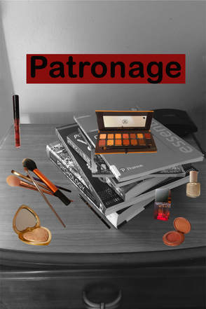
Title: Patronage
Medium: Image collage on photoshop Size: 60.9cm x 91..44cm Completed April 2018 Through the influence of Barbara Kruger the influence of advertisements on the daily lives of the public and the growth of materialism and importance of brands. |
Inspiration
|
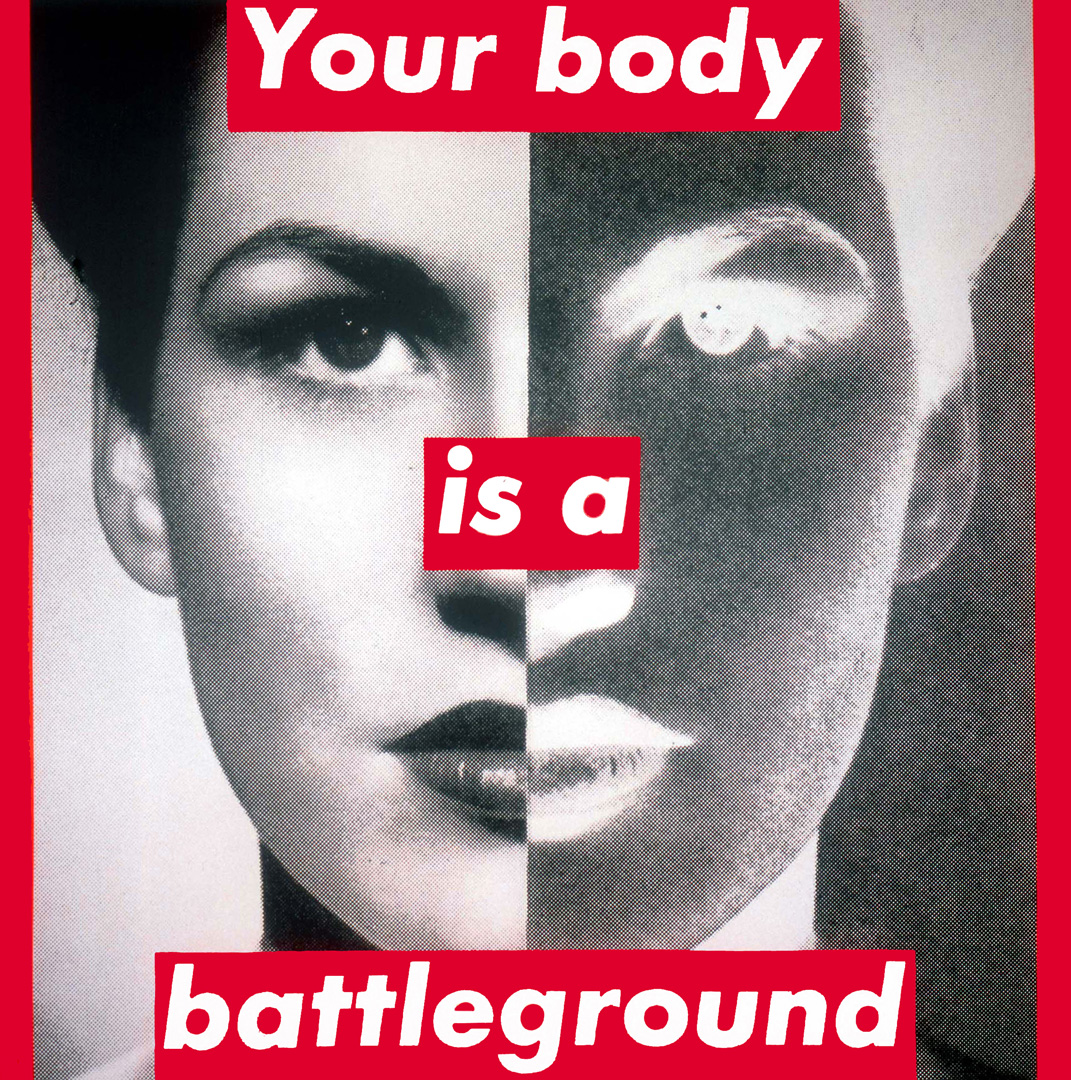
Barbara Kruger is best known for her direct slogans over black and white pictures. One of her best known works is her Untitled (Your body is your battleground) piece created in 1989. This piece was designed for the March for Women's Lives in Washington, D.C. She used a monochrome palette for the entire piece except for the highlight on the text with is a bright red, therefore bringing the most attention to the text. The image of the woman is split in half directly down the middle vertically with the left half having the woman be white and the right half having her be black. This choice of white and black on the woman represents the internal struggle between good and evil. The position in which the women is on the picture is purposeful, even having her look directly the camera when the photo was taken to make the image have an effect of looking out at the audience. This work shows the continued struggle of the feminist struggle in the modern world which greatly influenced my intentions when making the piece.
|
|
|
The inspiration I took from the piece when it came to the message the piece gave to the public was the intention of outing a problem in the world that is often not seen clearly in modern society. The problem I chose to address however pertained to the overwhelming presence of advertising and promotional material that has blended into everyday life. I liked the emphasis that the image and words on the provided by working together to guide the viewer onto the intended message. My intention is to also highlight certain items using a color palette and having the color or lack thereof help make the message of the piece more clear.
|
Planning
|
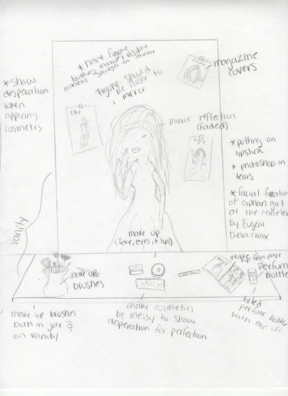
My first planning sketch depicts my intention of making the piece centered around unrealistic beauty standards for women. It depicts a young woman before a mirror surrounded by beauty products such as perfumes, make up brushes, and make up for the eyes, lips, and face. She is also surrounded by magazines of models, even having some taped on the mirror she's looking into. She is pictures applying make up while looking straight into the mirror. The idea was to portray the young women as insecure and needing to wear a full face of make up to feel better about herself. The abundance of magazine models communicated that the obsession the woman had with being beautiful.
|
|
|
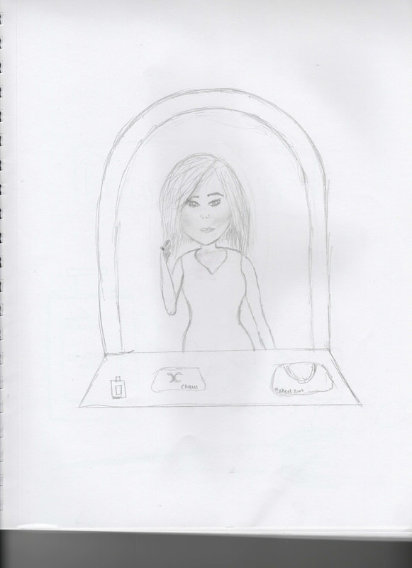
My second sketch was meant to give the message of exaggerated vanity having the girl in the picture be surrounded by items traditionally thought of as having the ability to help women be more beautiful. These types of items include make up, perfume, and feminine clothes such as dresses, . The eyes of the girl focus on the image of herself in the mirror to emphasize the vanity she feels. All the items around her are famous brand name items since items that are expensive brands such as Marc Jacobs, Michael Kors, Chanel, etc. are also traditionally seen as things only the high class can realistically afford.
|
|
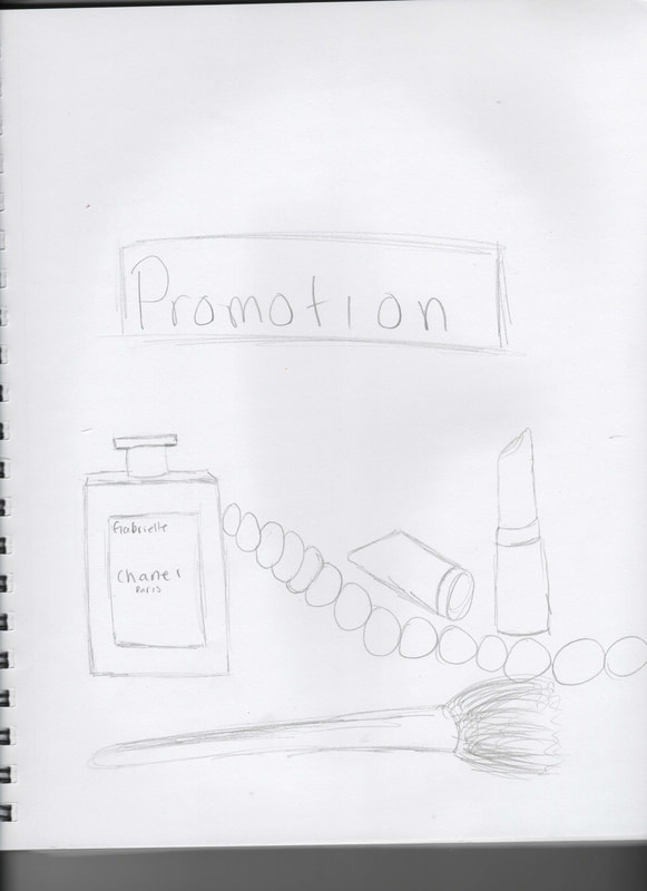
My sketch pertains to the thought of brands such as the aforementioned and how they seem to have taken over per say. There is a variety of brands that have increased promotional material to the point that wherever you go you are sure to find some kind of promotional material somewhere. The sketch contains various brand name products as well as the word promotion to show that these types of products seem to have taken over everyday life. The different products are things usually advertised to young women and usually advertised as helping them look beautiful.
|
|
Process
|
|
The first thing I did was choose what items I wanted to photograph which included perfumes, makeup brushes, and makeup products. Then, I made sure I had a spot with adequate sunlight to be able to get a good photograph without shadows when taking the picture. I took printer paper and used it as a background to have a better shot of the object I wanted to take a picture of without having shadows of other objects over it and to have a clean background. I then took the pictures of each object individually making sure the angle I took complemented the products making it look more appealing. The make up brushes, however, I photographed together to be able to make them look like they were in a pile. Then I transferred the photographs from my phone to my computer to be able to edit them in Photoshop.
|
|
For all the photos the first thing I did was create a new document that was 170 resolution and 24 inches wide as well as 36 inches in height. Then I used the quick selection tools to select the items and the cleaned up the edges using the lasso tool and clicked either the plus or minus on the menu for the lasso tools to add or subtract from the selection. I zoomed in as much as I could to be able to clean up the photo well. I also used the feather and smooth tools to make the edges on the photos look clean. I then selected copy and paste to the new layer I had created and proceeded to edit the image. Once I had the image ready on the new layer I selected the image option on the top menu and edited the hue and saturation of the of the photo to make the photo have more vibrant hues. I looked at images of products being advertised to be able to know how vibrant the colors are on the advertisements for the items I photographed.
|
|
|
|
Once I finished editing all the photos I took the picture of what would be the background. I set a variety of books on a desk with each book symbolizing something important to our lives such as education, lifestyle, hobbies, interests, travel ,etc. I made sure to take the picture at an angle that would complement the previous pictures I had taken. Once I had a good picture, I edited out things that were in the shot by selecting them with the quick select and deleting them using the context aware feature on. I also used the brushed on Photoshop to help blend the color better and make the scene look as if those items were never there. Lastly, I made the picture black and white by selecting image on the top menu and going to adjustments and selecting the black and white option.
|
|
After the background photo was ready I put all the images I had already photoshoped over the black and white picture with each items being a new individual layer. Once they were all on the file I edited them so that their size and position looked well over the black and white photo. I wanted them to look as if they were part of the original picture so I edited them being conscious of the perspective they were in and on what side of the books they would have to be to look as if they belonged there. Lastly, I added the word Patronage since while searching online for a good word to describe the message I wanted to get across I stumbled upon the word patronage and thought it fit perfectly with the concept. I made the font size 100 since I wanted the word to be a prominent feature of the piece and chose a font that would be able to be clearly read on the piece. Finally, I added a rectangle behind the word using the rectangle tool and made the rectangle red to mimic Barbara Kruger´s work.
|
|
Reflection
My piece compares to my inspiration because just like Barbara Kruger´s Untitled piece it plays with a monochrome palette using it as a basis to provide emphasis to another area of the piece without leaving the background blank. However, my piece differs from what the emphasis is trying to be provided upon since in Kruger's piece the emphasis she wanted to bring was to the text which is why she inserted a red rectangle behind it, however, in my piece I wanted the emphasis to be added to the products I altered to give more shape to the meaning of the piece. Since I didn't want to take away the emphasis from those items I struggled about deciding whether or not to actually include the text in the piece but at the last minute decided that the text would bring some much needed clarity to the message of the piece. The color palette was one of the major components to the piece since I wanted to get across that all the advertisements often make us focus on consumerism while focusing on the advertising itself. My piece also differs from Kruger's piece since mine uses asymmetrical balance while her untitled piece uses symmetrical balance through the use of the woman's face.
Connections to ACT
Clearly explain how you are able to identify the cause effect relationship between your inspiration and its effect on your artwork?
The cause effect relationship between the work and the inspiration is clearly seen through the influence it had on both the message of the piece, which is seen through the similar theme in the criticism of things affecting the overall quality of life, and on the techniques used on the piece, such as the red rectangle behind the text to emphasize what is says.
What is the overall approach the author has regarding the topic of your inspiration?
The overall approach is that of a learner through the consideration of the original intentions Barbara Kruger had for her pieces.
What kind of generalizations and conclusions have you discovered about people, ideas, culture, etc. while you researched your inspiration?
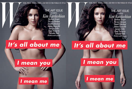
The discovery of how to integrate text onto a piece was gained throughout the investigation regarding the inspiration and all her previous works, specifically those that gained the most attention such as (Your body is your battleground and It´s all about me I mean you I mean me.
What is the central idea or theme around your inspirational research?
The central idea around my research was wanting to promote change in something that would benefit society and the quality of life of others.
What kind of inferences did you make while reading your research?
The kind of inferences I made at first while reading were that Barbara intended her work to be what people interpreted it to be about however a piece can have a variety of different meanings to different people.
The cause effect relationship between the work and the inspiration is clearly seen through the influence it had on both the message of the piece, which is seen through the similar theme in the criticism of things affecting the overall quality of life, and on the techniques used on the piece, such as the red rectangle behind the text to emphasize what is says.
What is the overall approach the author has regarding the topic of your inspiration?
The overall approach is that of a learner through the consideration of the original intentions Barbara Kruger had for her pieces.
What kind of generalizations and conclusions have you discovered about people, ideas, culture, etc. while you researched your inspiration?
The discovery of how to integrate text onto a piece was gained throughout the investigation regarding the inspiration and all her previous works, specifically those that gained the most attention such as (Your body is your battleground and It´s all about me I mean you I mean me.
What is the central idea or theme around your inspirational research?
The central idea around my research was wanting to promote change in something that would benefit society and the quality of life of others.
What kind of inferences did you make while reading your research?
The kind of inferences I made at first while reading were that Barbara intended her work to be what people interpreted it to be about however a piece can have a variety of different meanings to different people.
Bibliography
"Barbara Kruger Artist Overview and Analysis". [Internet]. 2018. TheArtStory.org
Content compiled and written by Justin Wolf
Edited and published by The Art Story Contributors
Available from: http://www.theartstory.org/artist-kruger-barbara.htm
[Accessed 26 Apr 2018]
Content compiled and written by Justin Wolf
Edited and published by The Art Story Contributors
Available from: http://www.theartstory.org/artist-kruger-barbara.htm
[Accessed 26 Apr 2018]
