Dry Point
Blackeyed Susans
|
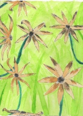
Title: Blackeyed Susans
Medium: Ink and Gouache on paper Size: 22.5 cm x 20 cm Completed October 2017 The original intentions for my piece were to have the piece be symbolic upon the issue of immigrants particularly those coming from Latin America. My piece was influenced by Vincent Van Gogh´s piece Sunflowers because of the lines that could be clearly seen in his piece. I drew my piece by hand but used pictures of blackeyed susans as reference. |
Inspiration
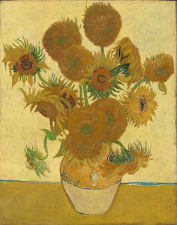
Sunflowers, Vincent Van Gogh, 1888
|
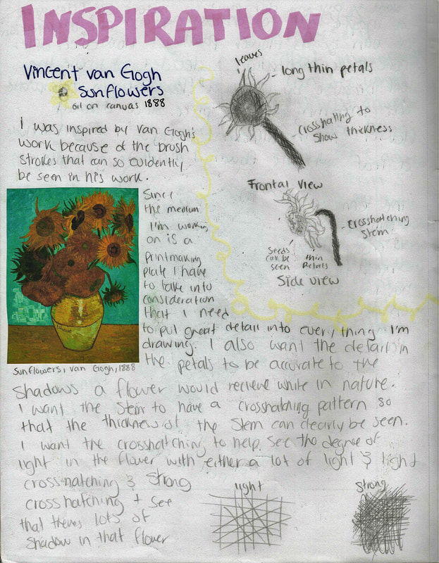
My piece was inspired by Vincent Van Gogh's Sunflowers painting. I decided to use this as my inspiration since Van Gogh is known for his strong brush strokes which was perfect for the effect I wanted for my dry point project. Van Gogh painted this painting while in Arles in southern France during the time he bought his yellow house. He painted various of these sunflower paintings to decorate his home. His thick brush strokes called impasto gave the piece the texture that can be seen in the petals and stems of the flowers. I attempted to give my piece the same effect as Van Gogh to the petals and stems of the flowers. The way Van Gogh used lines in the painting shows movement all over the piece guiding the eye all around the painting. I want to give my piece a similar effect of guiding the eye from flower to flower. My piece, however, will be in a field instead of a vase. I want to give my piece the illusion of a spacious environment so an outside setting will be better.
|
|
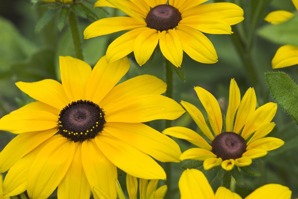
I used black-eyed Susans in my piece because they represent justice and I want this piece to represent the justice and equality minorities want to see in everyday life. Black-eyed Susans come in many different shades of yellow and orange. They have scratchy hairy leaves and a dark center seed head. I will use this as a reference for when I paint my piece with gouache after printing it. I will be using gouache to be able to accurately capture the delicacy and smooth texture of the petals and the scratchy texture of the leaves and stem. This medium will also help because I will be able to capture the opaqueness of the stem and center seed head and have the petals be less opaque to show the texture they have compared to the other parts of the flower. My piece, however, will have more flowers than the reference picture and I will try to get highlights and shadows from different angles in the flowers so that they all have some individuality.
|
|
Planning
|
|
When I first began the project I wanted to do something with plants since they have veins on the leaves, petals, and stems. My initial experimentation consisted of drawing my first drawing sketch which is a maple leaf. I tried to stay true to how the veins on a real leaf might look like however once I had finished the leaf I realized two things. The first is that in order for the plant to look clearer once the ink was on the plate I might want to focus on the shadows caused by the sun on the plant so that the lines wouldn't mix into each other making the lines unrecognizable. The second was that if I used a flower instead of a leaf I would be able to control the meaning of the piece more effectively since flowers have different meanings.
|
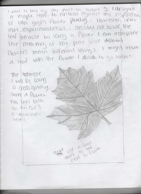
|
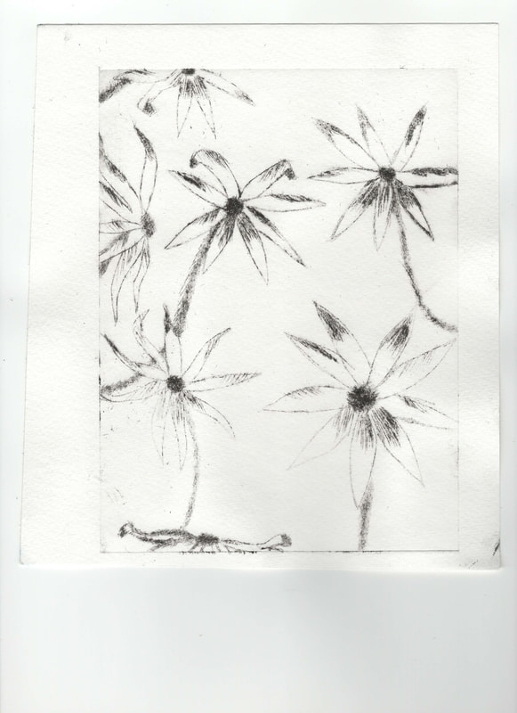
The next part of my experimentation was deciding what flower to use for my piece. I looked at various sources to see what I might be interested in using for my piece. I stumbled upon the blackeyed susans which as it said in the source represents justice. Before I made my final sketch to use in my piece I decided to draw a flower to practice using shadow and how to represent it in the petals.
|
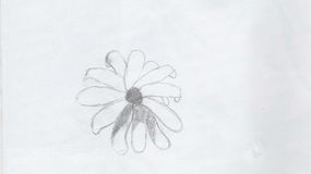
Planning sketch 2
|
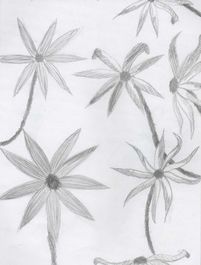
Planning Sketch 3
|
My final sketch had long thin petals like blackeyed susans and i only drew a few of them because I wanted my piece to differ from my inspiration in some way and I decided that the best way for that to happen was by having my piece take place outside. I drew only a few flowers to leave space for grass in the background. I also wanted different angles to be able to experiment with shadow. I used crosshatching because I felt it had the best effect on the stem and petals and thought I would be able to use it to show the thickness or thinness of the stem as well as being able to show the intensity of the shadow in the flower.
|
Process
|
|
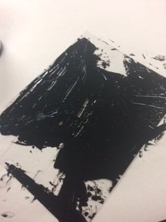
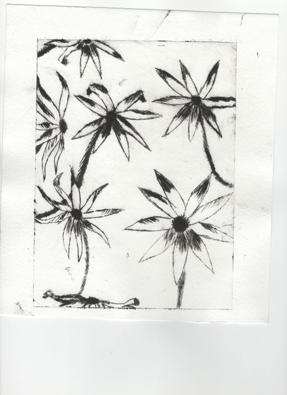
I taped the the plate on top of the planning sketch and used the dry point tool to go over the sketch and outline the sketch. I also changed some of the shadows because some of the shadows I previously had felt like they were not correct. Some of the skills I developed throughout this process were knowing how to use the dry point tool since the tip is shaped like a triangle I usually had to find the sharpest side first so that I could made straight lines for the stem. The other sides I at times used to do the curves of the petals. Another skill I developed was being able to use the dry point tool in the edges of the plate well enough so that the line would show up on the paper but not too deep so that the plate would not brake at the edges. Some techniques I used to be able to have accurate dimensions was taping the plate accurately.
|
|
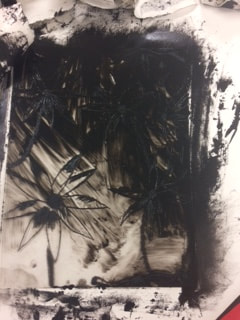
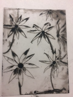
The printing process began with me submerging two pieces of watercolor paper in a bin with water so that the paper would get soft and the paper would fill the spaces in the plate and absorb the ink only in that particular spot. I grabbed a piece of newspaper and put my plate on top of it. After that I took some ink and smeared it on my plate with a palette knife. I made sure the entire plate was covered in ink although looking back I probably used too much ink as it was hard to remove. I had to remove the ink using ripped of pieces of more newspaper. I had to rub all the ink off except the one that sank into the actual holes in the lines I carved. Once I finished doing that I dried the watercolor paper and put it in the press with the plate to get two copies of the piece so that I could decide which I liked better.
|
|
|
|
After printing I let the paper dry and experimented with the gouache since i've never used it before. All i knew about gouache was that it was watercolor so I knew it would work well with the watercolor paper and that it is opaque but can also be translucent if mixed with water. I decided to practice both painting with the opaque gouache right out of the tube and then I mixed it with water to see how it worked when mixed with water. I then tried to do a leaf to see how the intensity in color changes from opaque gouache to translucent gouache. Once I felt like I had a better understanding of the gouache I used the techniques I learned to paint the parts of the flower that were meant to be shadow with opaque gouache while I used translucent gouache for the other parts of the flower to show the delicacy of the petals. I also did the same for the background painting one grass blade at a time since I knew the lines of my brush strokes would show after it dried.
|
After finishing my piece some critiques I got were that the shades I used didn't look like they belonged together. The example they gave me was the light green I used for the grass. I was told this made the flowers look darker and gloomy since the yellow I used for the flowers had a darker shade to it. Next time I will use a darker shade of green and I won't be afraid to mix the gouache colors. However, first I will test the color since I also want to be sure the colors are well mixed before putting the gouache on the actual watercolor paper. I saw other people using flowers for their dry point as well and saw that they used pictures and outlined them to be able to get a more accurate shadow to light proportion on the flower petals. I thought it was a good idea not only because the proportions would be more accurate to the true proportions of the flowers and the correct amount of petals since I later realized the amount of petals in the flowers is not correct.
Reflection
My piece is similar to the inspiration in the fact that they both use flowers and they both use lines to show movement in the piece from one flower to another. My piece is different from my inspiration since Van Gogh's piece is in an interior setting in a vase and my piece is in an exterior setting in a field. The balance in both pieces is asymmetrical balance since the emphasis is on the flowers however the flowers in Van Gogh's piece are in the center while mine are all over the piece giving the piece a more circular movement. The lines in Van Gogh's painting are also more blended into the painting while the lines in my piece (except the grass) consist of the outline of the flowers. Some of the challenges for my piece where that I have never done a dry point piece before so I didn't know what to do to make sure my piece would not turn into a blob once i put ink on the plate and put it in the press. I also didn't know how deep I needed to make the lines on the plate and I was worried about that since in previous projects it was important to have the lines not be too deep but not too shallow either. Some things I could have improved on were that I did not stick to my original sketch for the piece when it came to transferring it onto the plate which made my piece look different from what I intended. I also would change the shade of green of the grass since I did want to but didn't since I have never worked with gouache before and was afraid of messing up my piece.
Connections to ACT
I am able to identify the cause effect relationship between my inspiration and its effect on my artwork by seeing how the brush strokes in Van Gogh's piece influenced how i chose to use the gouache in my piece. The overall approach regarding my topic of inspiration is a technical one since i focus on the technique Van Gogh used in his piece to help guide me with my own. The kind of generalizations I have discovered about culture in our society is that we always assume that when someone talks about immigrants they mean illegal immigrants while in this country we're all technically immigrants except Native Americans. The central theme of my inspirational research is that lines are important in showing movement in a piece and that lines aren't always shown through the outlines of the things in the piece. The kind of inferences that I made while researching were that Van Gogh intentionally made his pieces show brush strokes to show movement and texture in his piece.
Bibliography
The National Gallery. “Sunflowers.” The National Gallery, The National Gallery, www.nationalgallery.org.uk/paintings/vincent-van-gogh-sunflowers.
“Language of Flowers.” Language of Flowers - Flower Meanings, Flower Sentiments, www.languageofflowers.com/flowermeaning.htm.
Iannotti, Marie. “Rudbeckia - Choosing and Growing Black-Eyed Susans.” The Spruce, The Spruce, 3 Oct. 2017, www.thespruce.com/choosing-and-growing-black-eyed-susan-1402860.
“Language of Flowers.” Language of Flowers - Flower Meanings, Flower Sentiments, www.languageofflowers.com/flowermeaning.htm.
Iannotti, Marie. “Rudbeckia - Choosing and Growing Black-Eyed Susans.” The Spruce, The Spruce, 3 Oct. 2017, www.thespruce.com/choosing-and-growing-black-eyed-susan-1402860.
